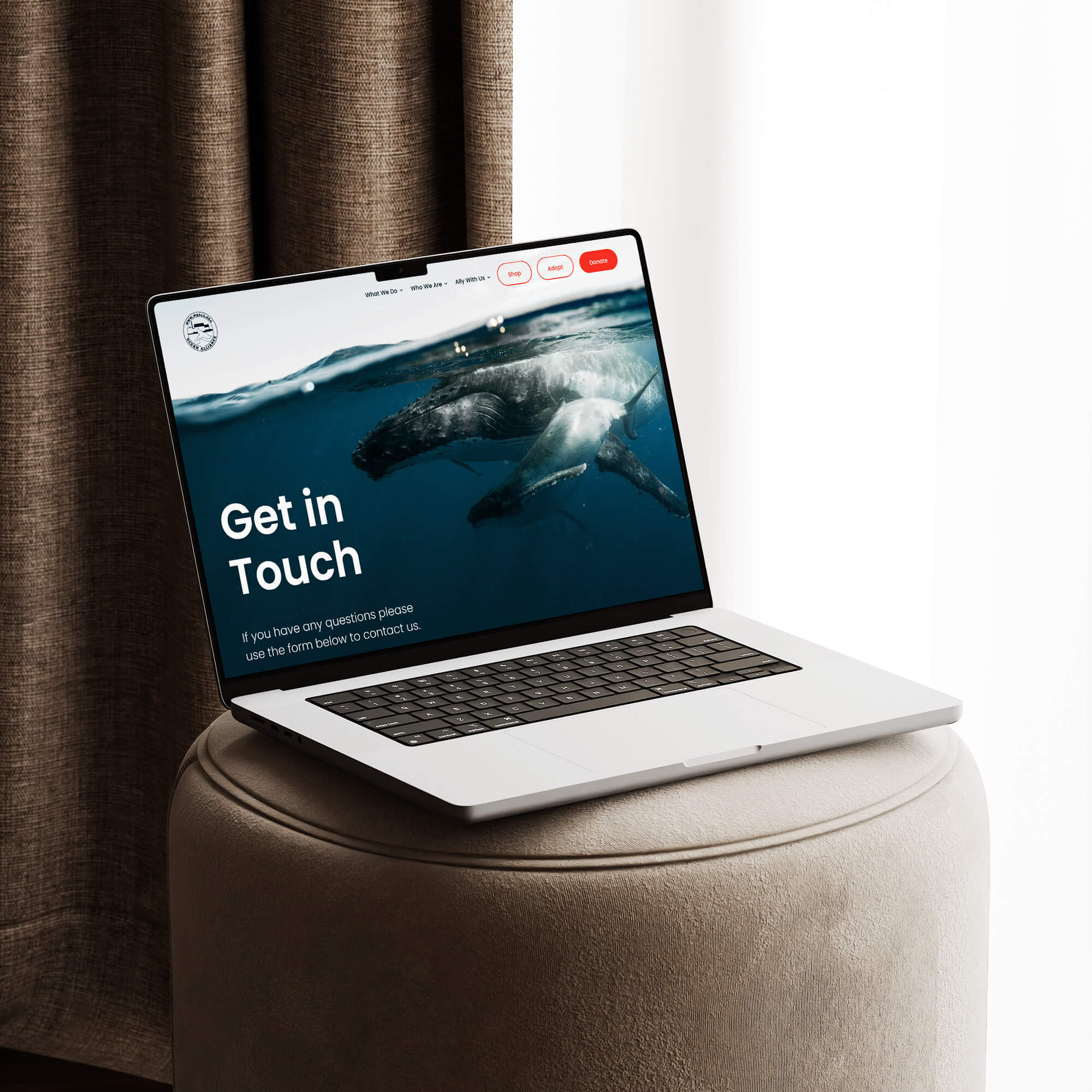
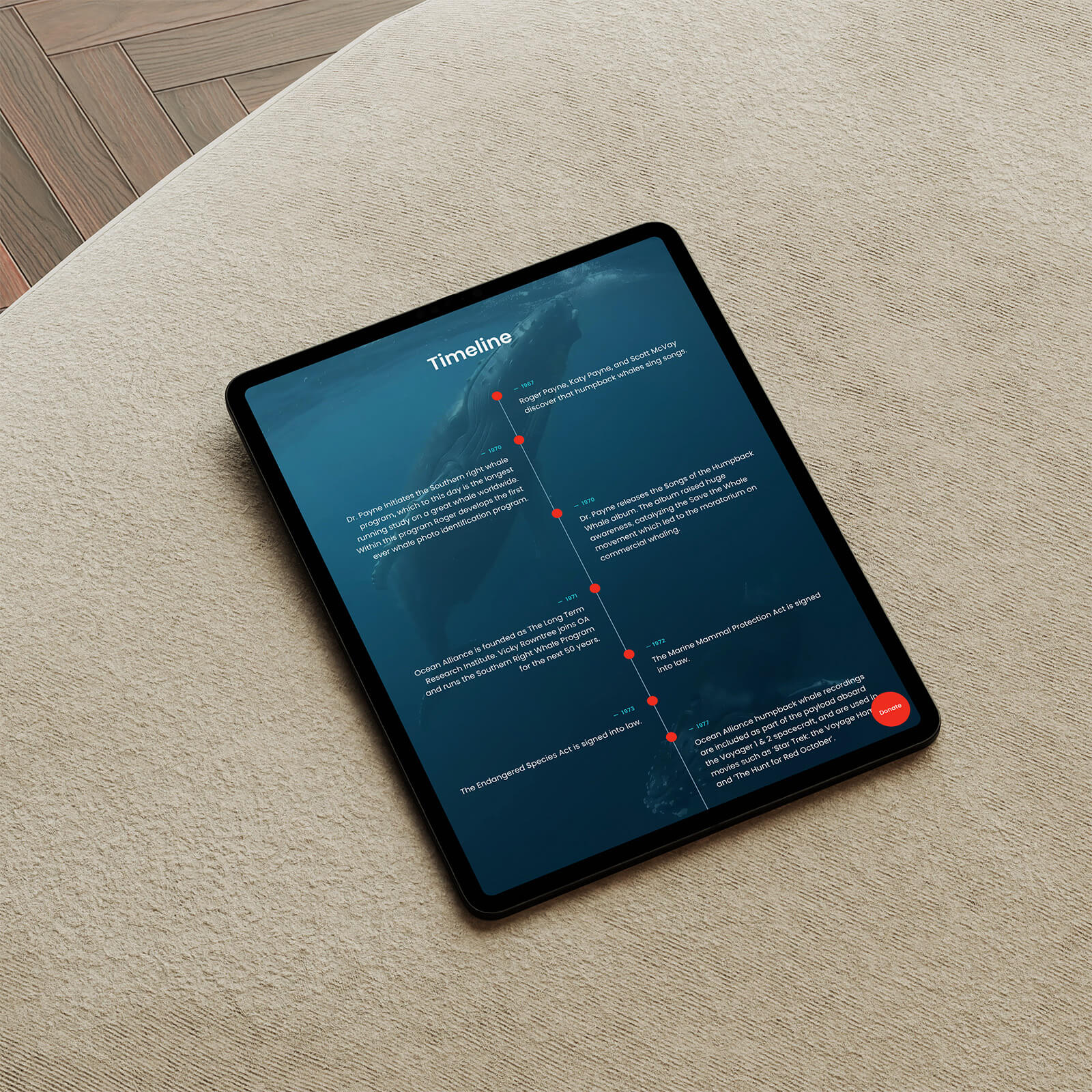
The design brief was to make a visitor feel Ocean Alliance's world before they read about it. Rather than building a site that explains what Ocean Alliance does, the layout was built to create immersion first. Deep ocean blues, a gradient that moves from surface light to open-water depth, a whale visible in the distance of a background scene as if looking out into their environment rather than at a webpage. The white sections aren't a departure from that feeling, they give it room to land before the next immersive moment arrives.



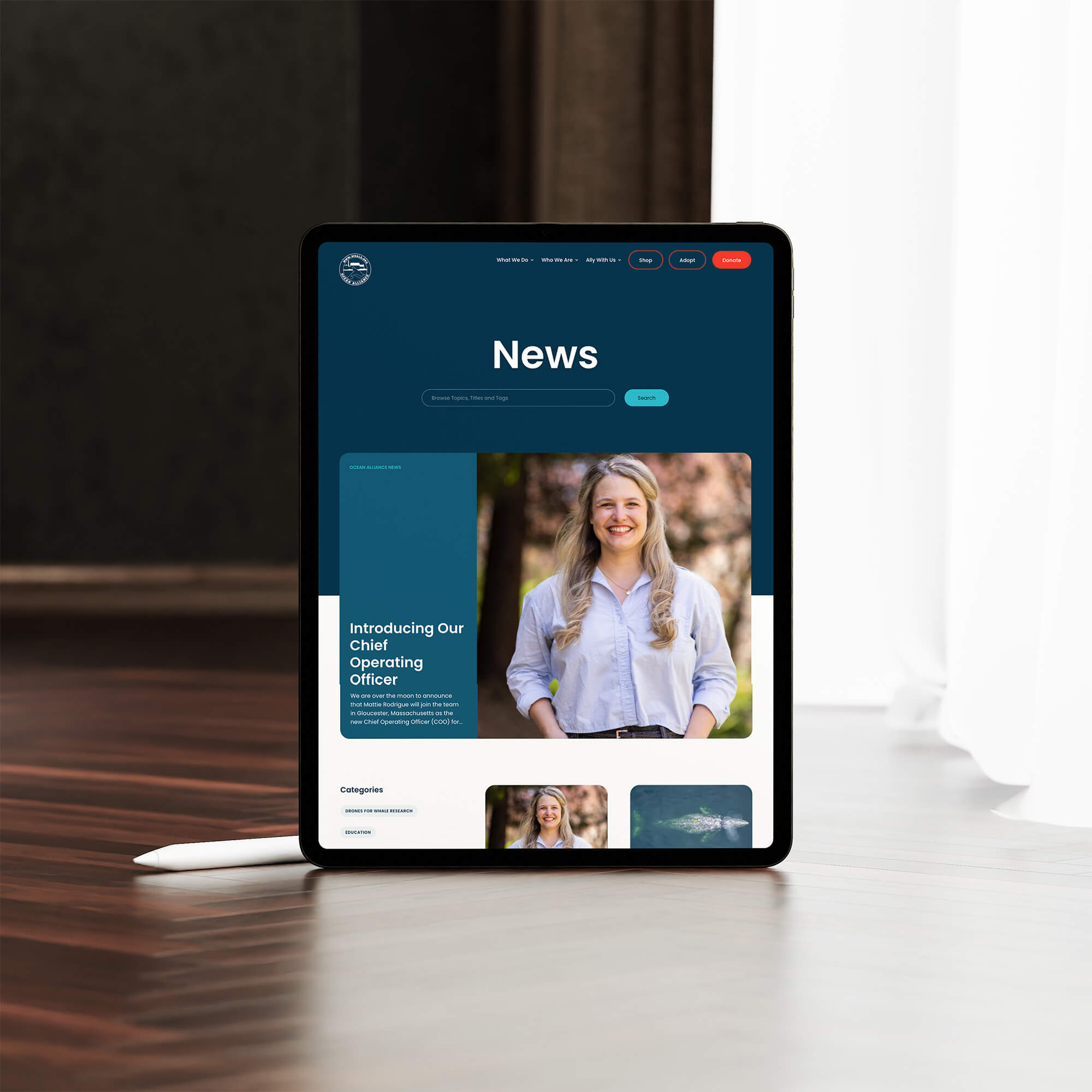

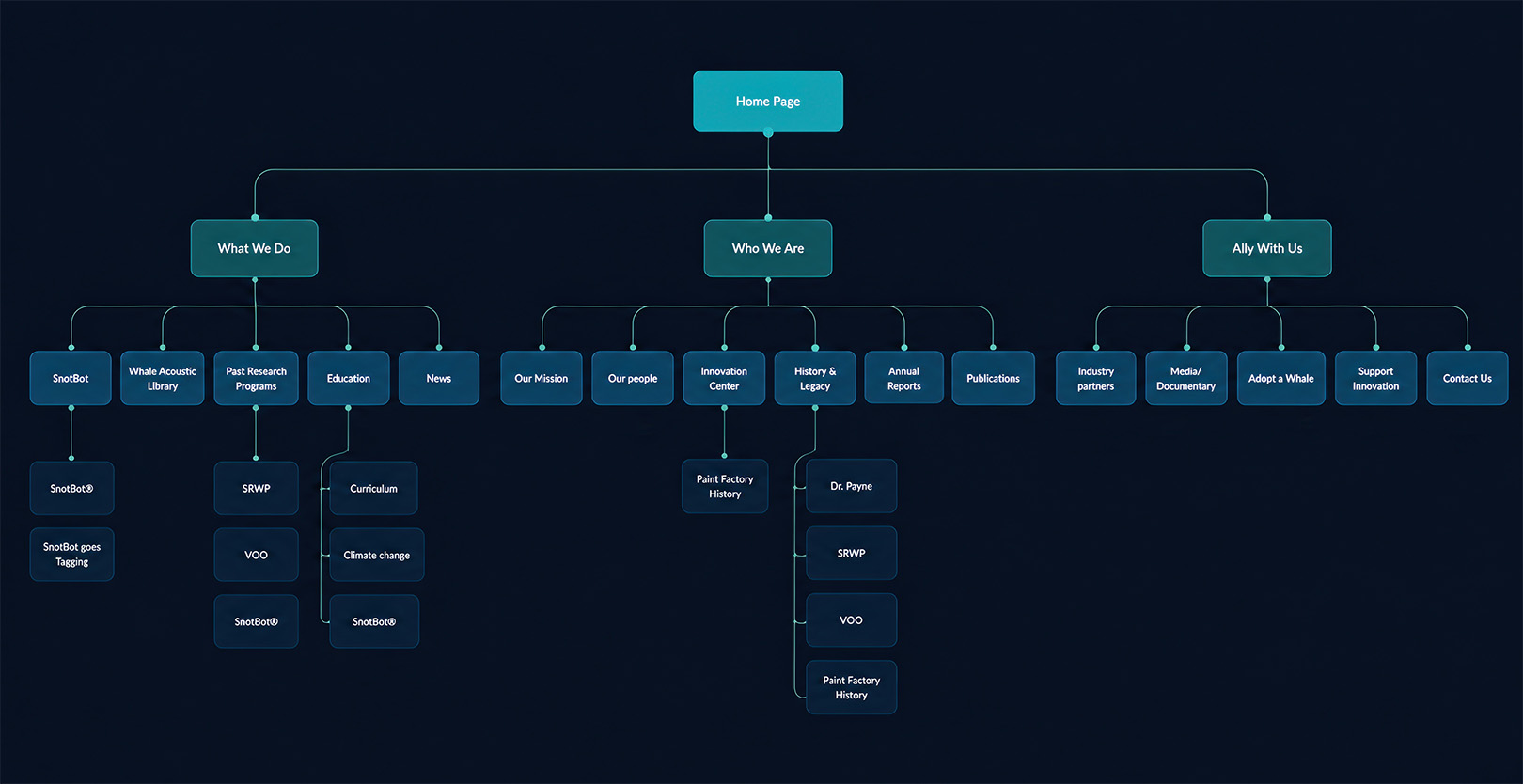
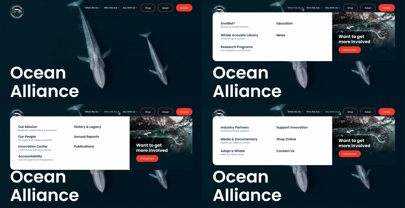
A conservation organization with fifty years of research, multiple active technology programs, an education arm, and several ways to get involved can easily become overwhelming to navigate. The sitemap structured 28 pages across three clear pillars before a single layout was designed. A mega menu carries that same structure into the navigation itself, giving visitors an immediate overview of everything the site holds without needing to dig for it.
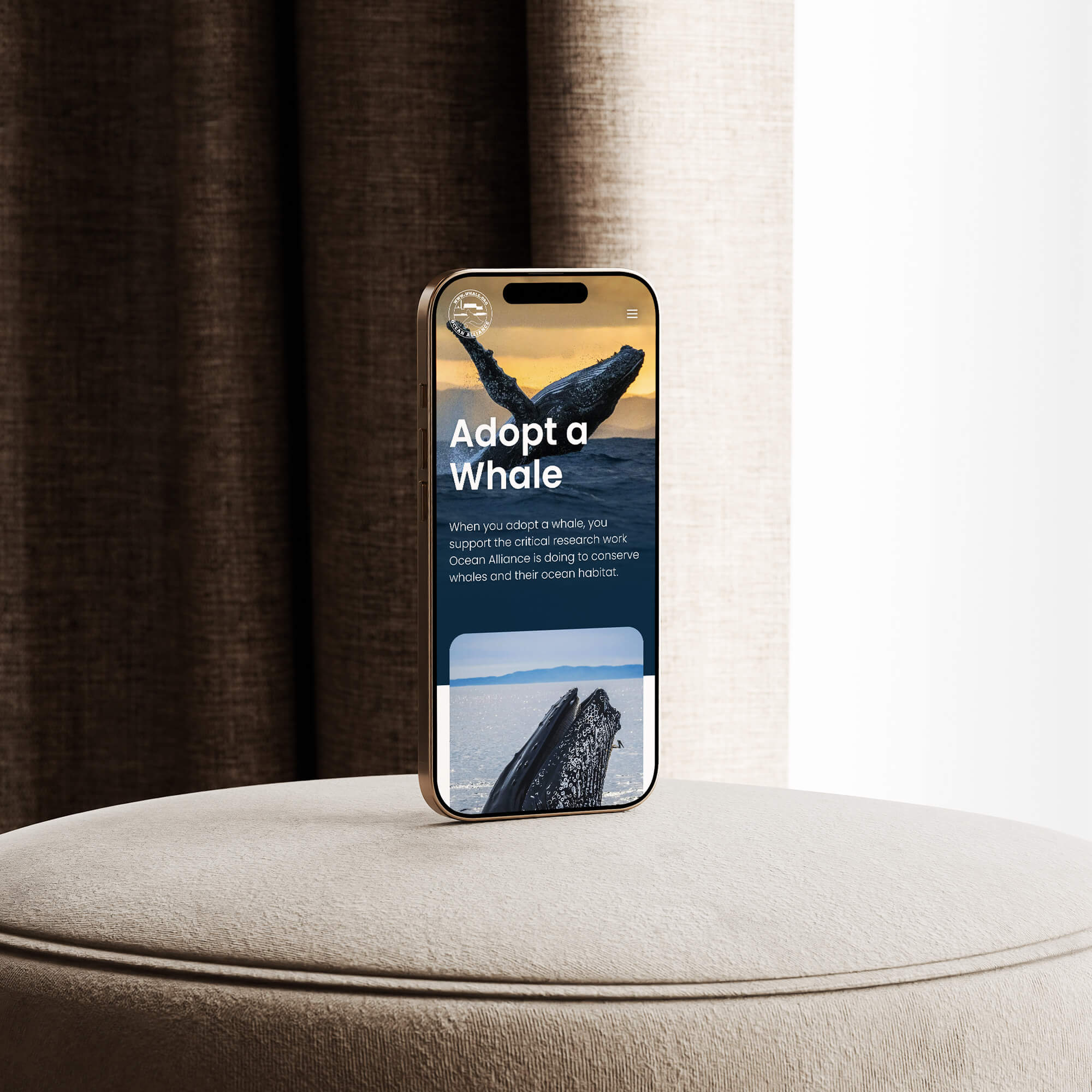
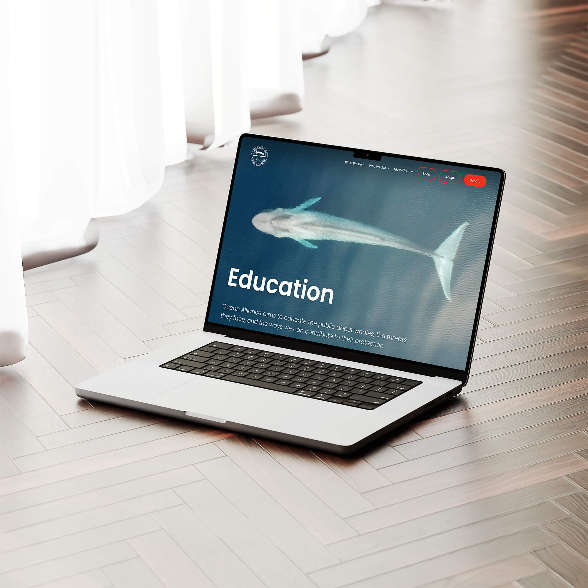

Ocean Alliance needed a site that could hold a lot without feeling cluttered: decades of research, multiple technology programs, an active blog, education content, and several ways to get involved or donate. The structural challenge was keeping all of that navigable without flattening the emotional weight of what they do. Each main page leads with a full-width image, either of whales in the wild or of the Ocean Alliance team at work, grounding every section in the reality of the organization before the explanatory content begins. The information is layered underneath that, accessible without competing for attention with the cause itself.