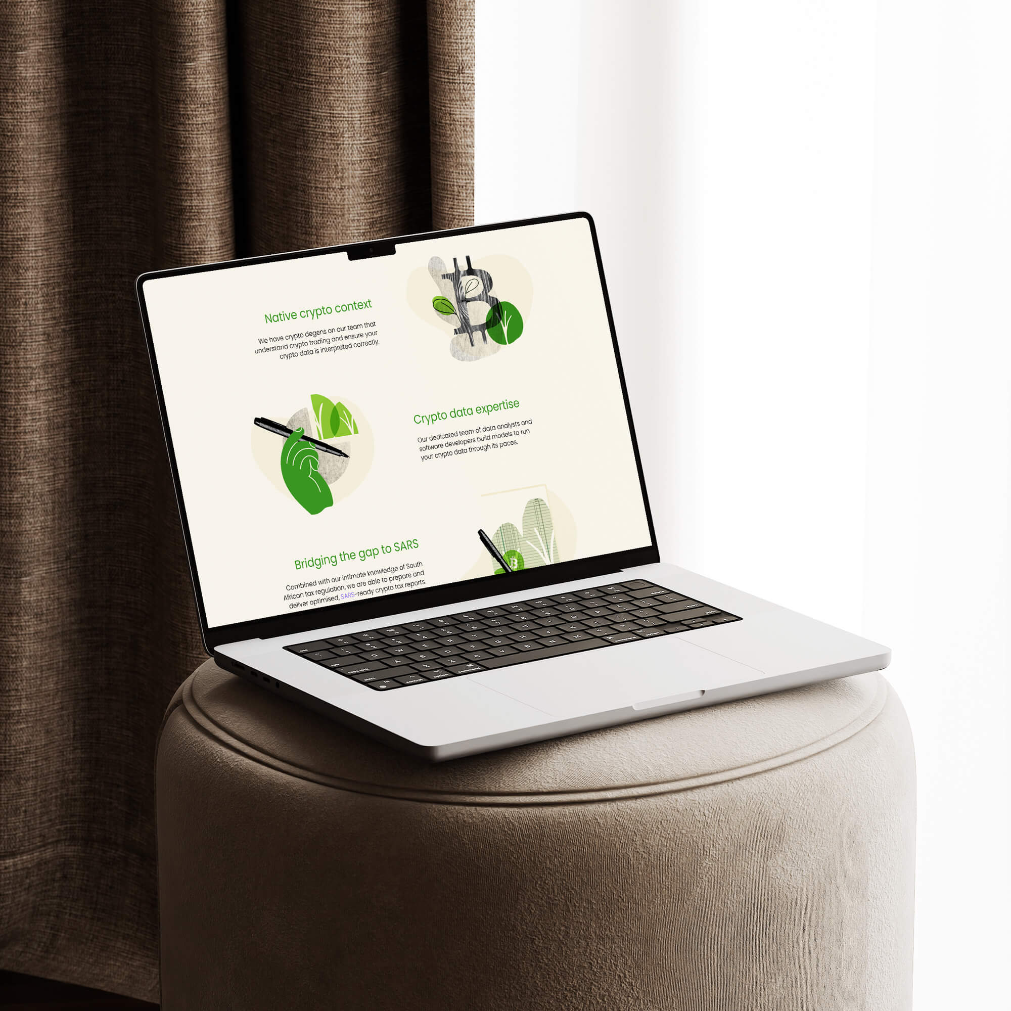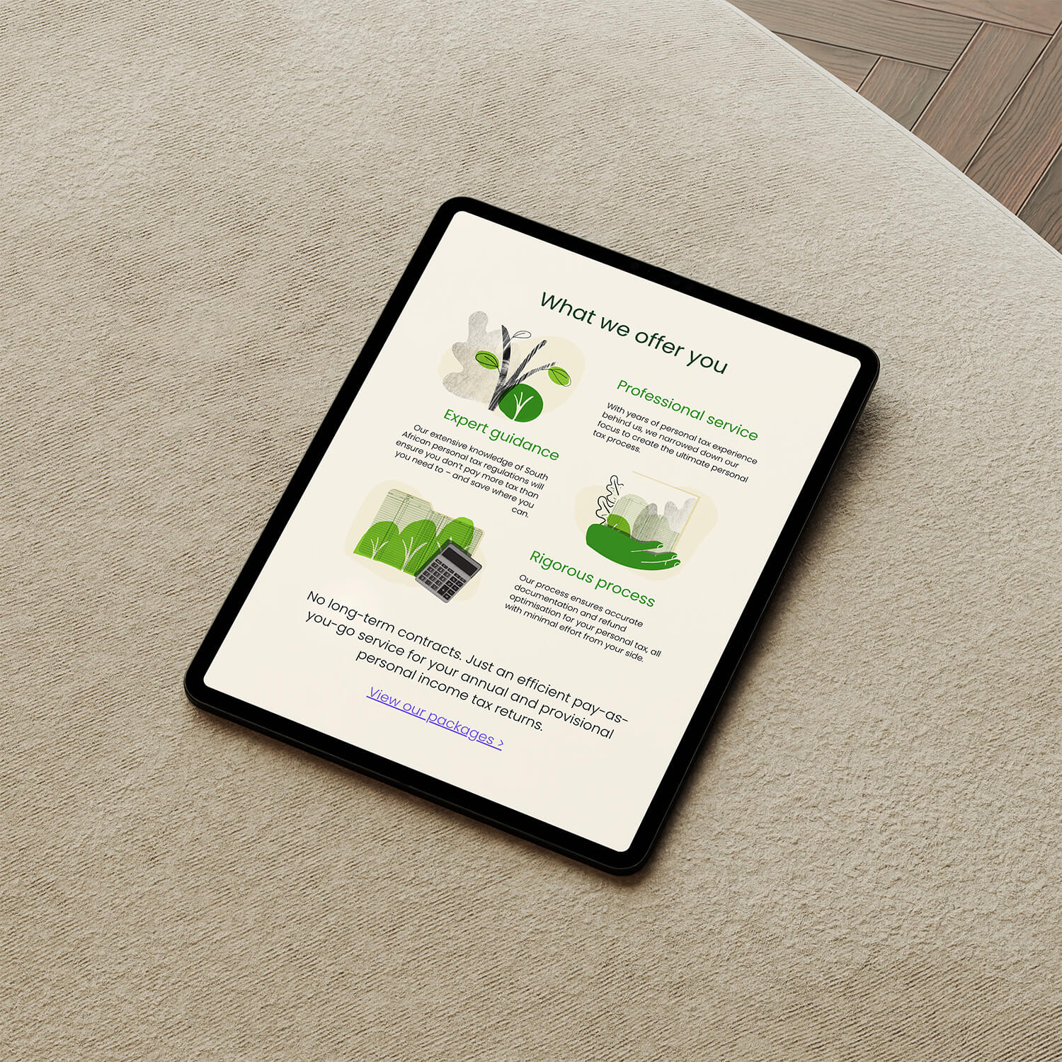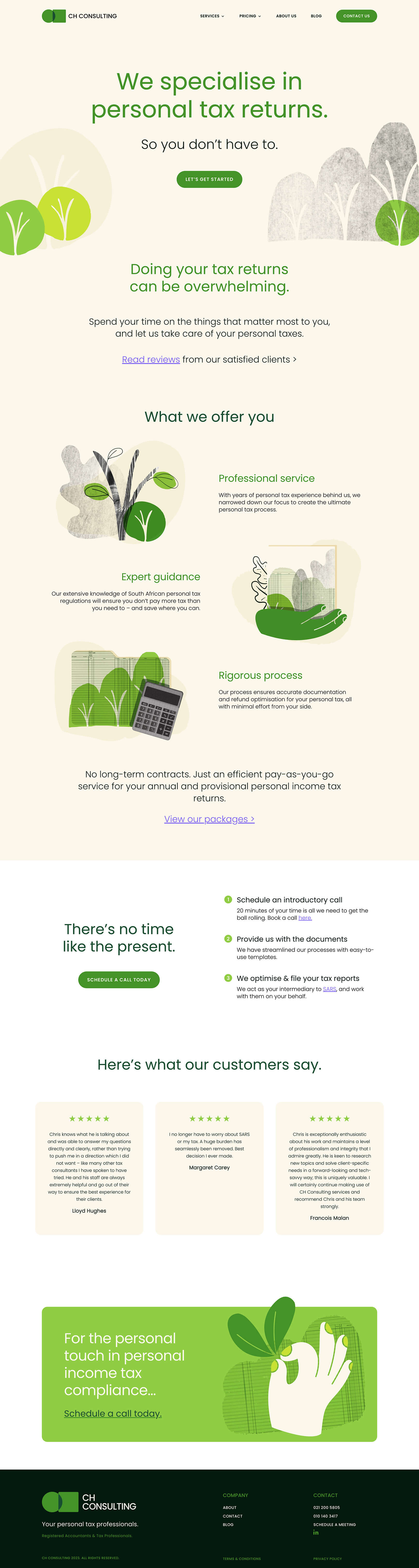
The brief was to move personal tax away from intimidating and toward approachable, and every layout decision followed from that. The warm parchment background, the bold green, the collage-style illustrations with their organic shapes and stylized hands, all of it chosen to signal that this firm is different from the traditional image of the industry. The layout's job was to carry that brand direction clearly: bold typography up front, illustrations given space to breathe, and a conversion path that keeps a discovery call within reach at every scroll point.

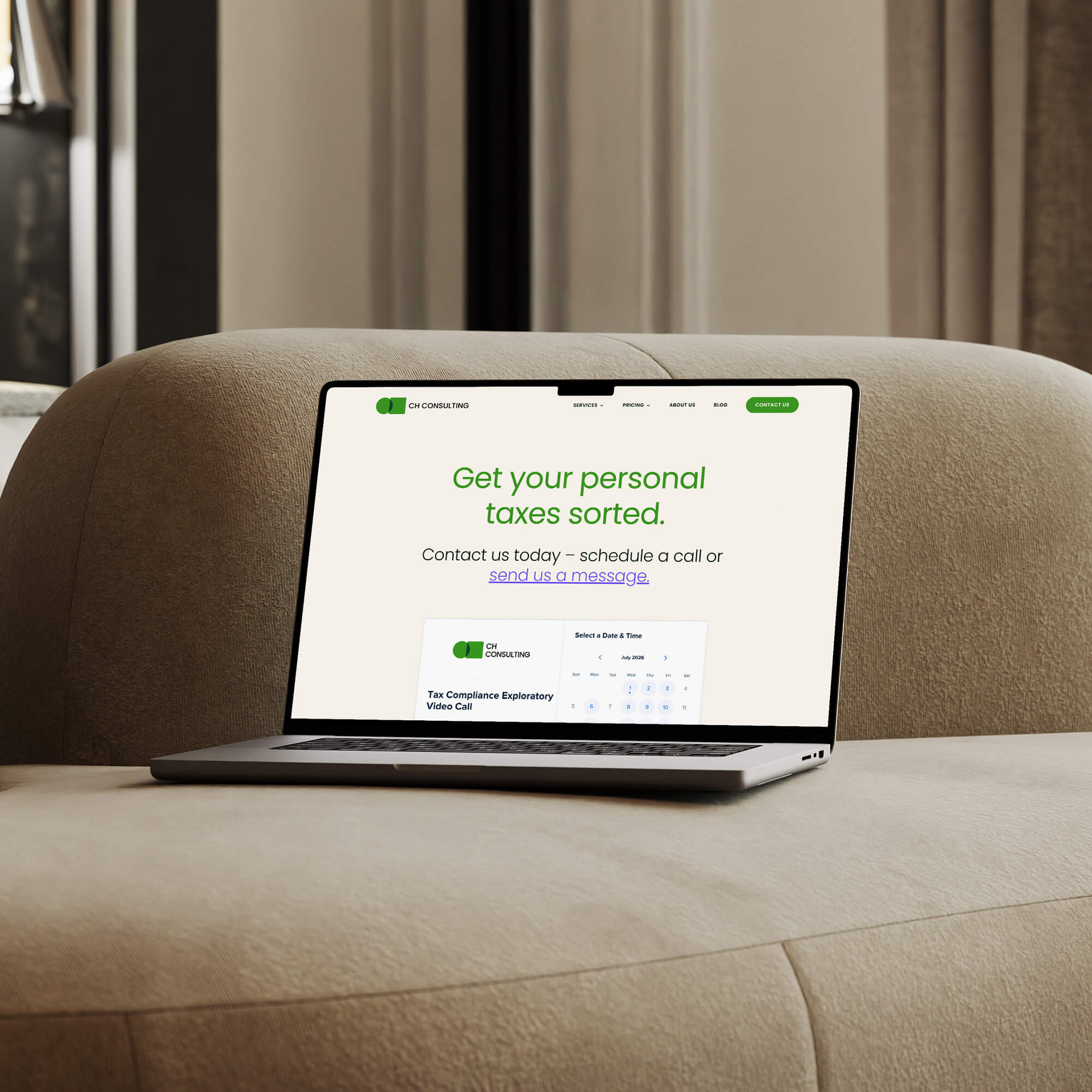



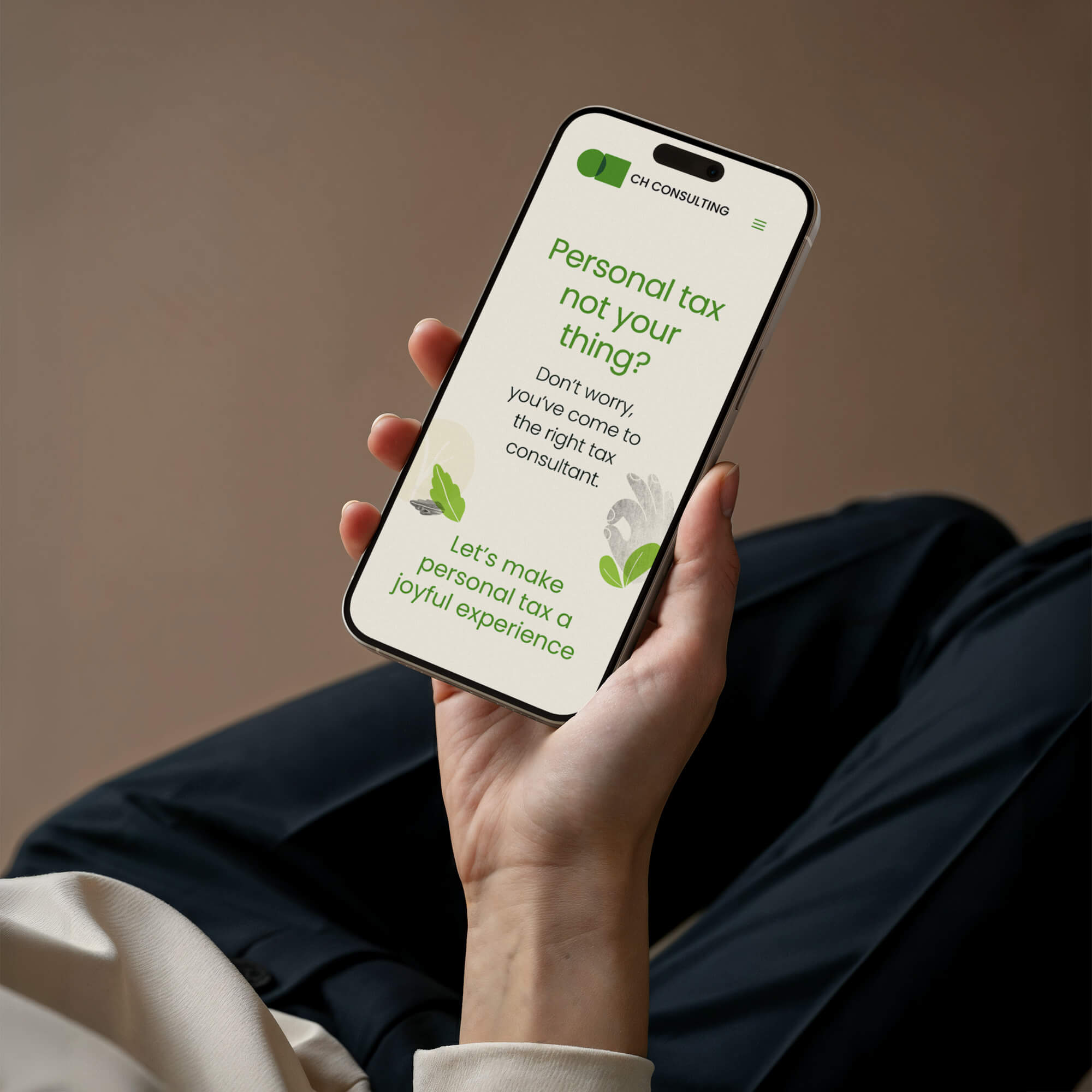
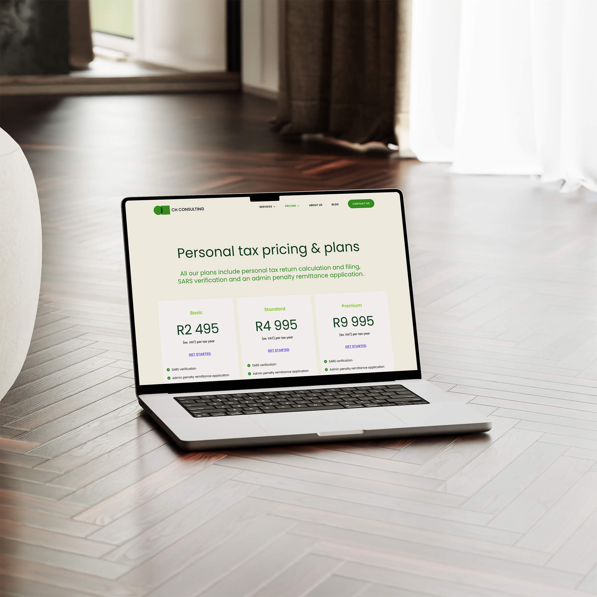

The user journey was built around a single action: booking a call. Rather than presenting CH Consulting's full service range up front, the layout guides visitors through the problem (tax is overwhelming), the solution (we handle it), the process (three simple steps), and social proof (client reviews), before landing on the call to action. Nothing on the page competes with that path. The illustrations do the tonal heavy lifting so the layout itself could stay clean and direct.