


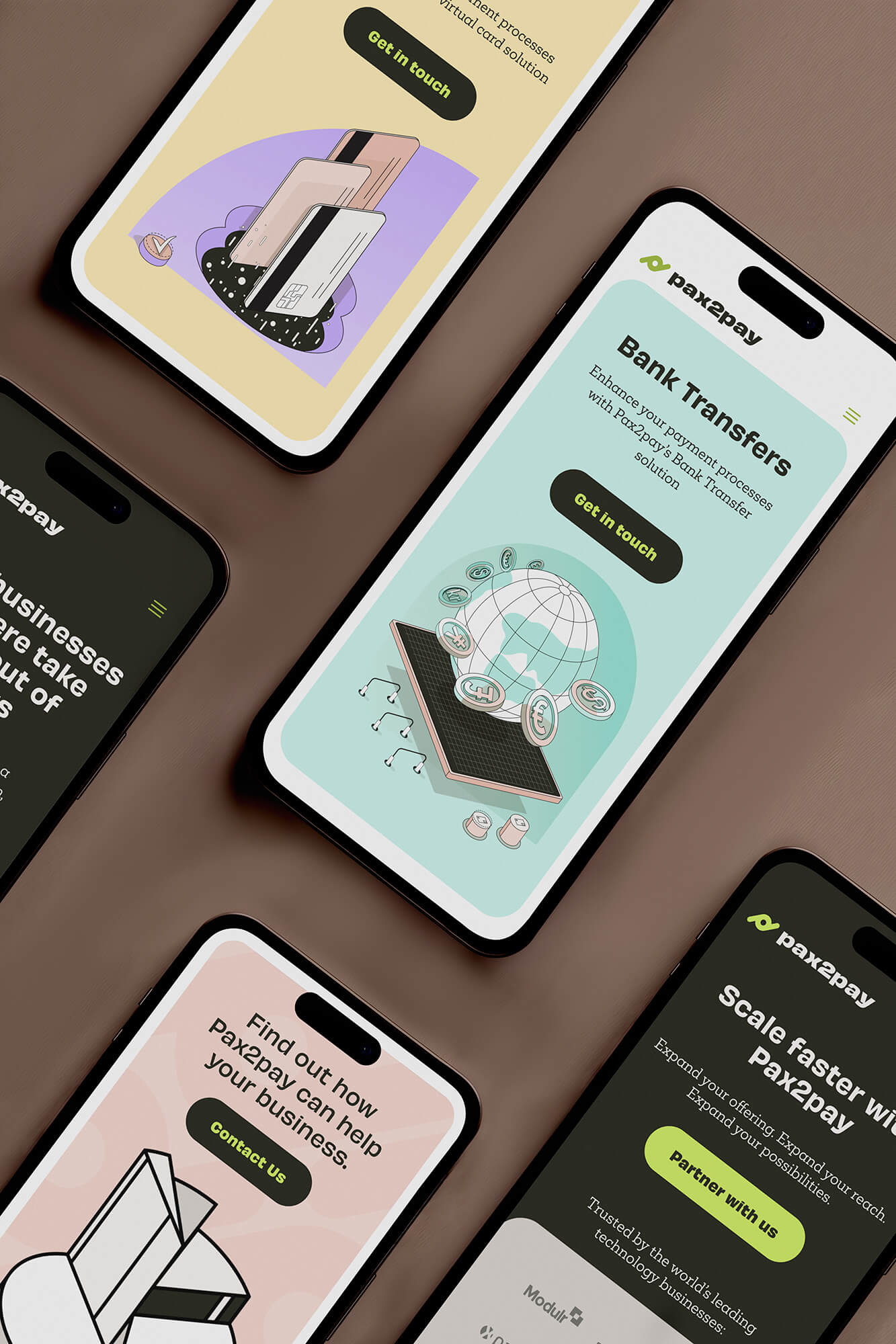
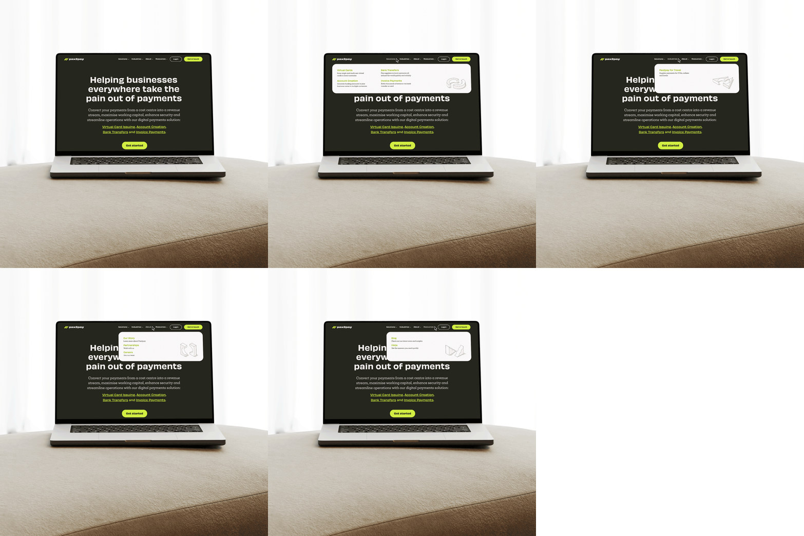
Pax2pay had been planning a rebrand for some time before the project kicked off. The brief was to develop an identity that felt modern and approachable while still holding authority in the payments space. A palette that held that tension deliberately: the dark background anchoring credibility, the sharp lime accent keeping it from reading as just another serious fintech. In a market where most payment platforms look either overly corporate or startup-casual, the layout needed to carry that middle ground and make it feel intentional from the first scroll.





Each page went through several layout versions before a direction was agreed. The Figma board was the working space where those decisions got made, tested, and refined before anything was built.

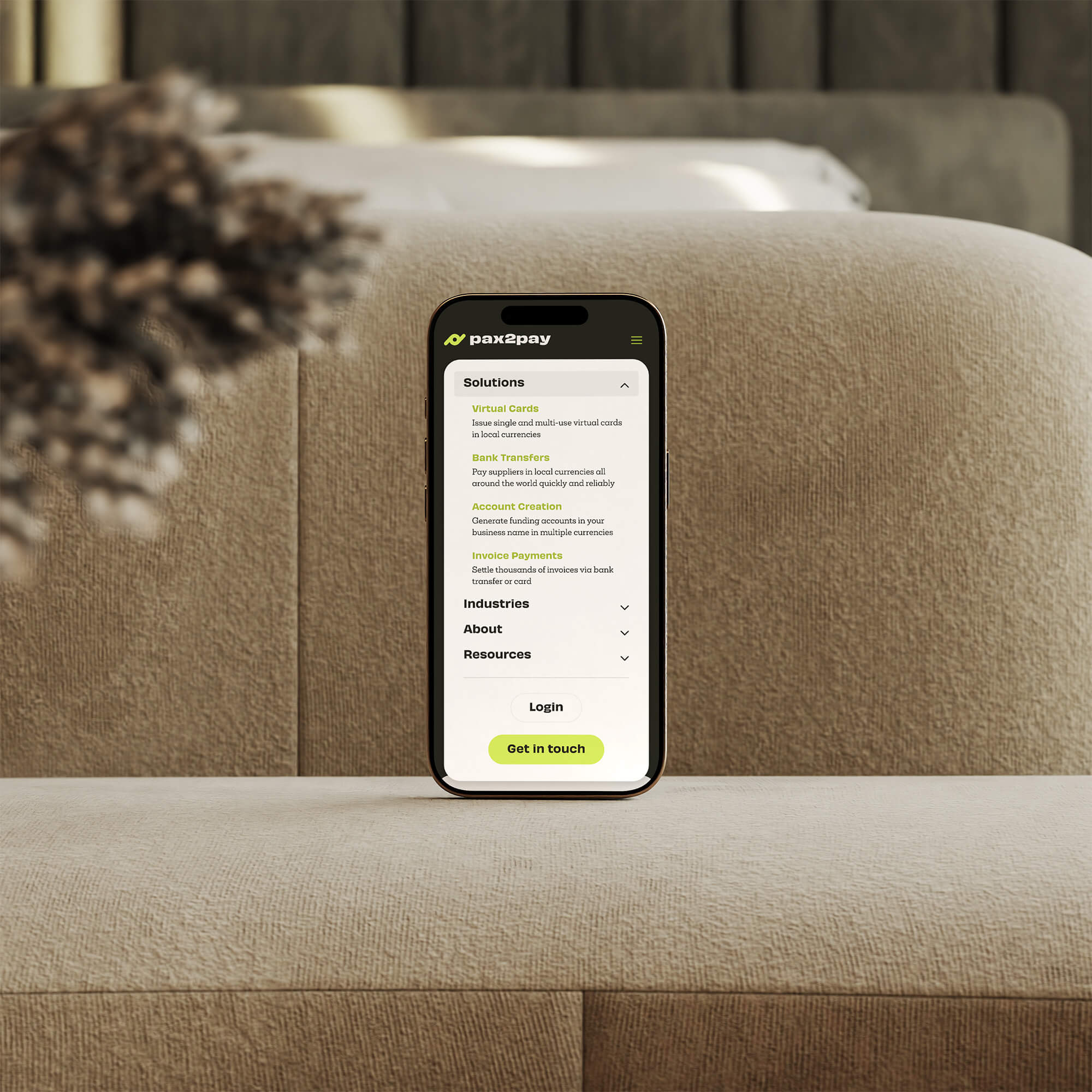
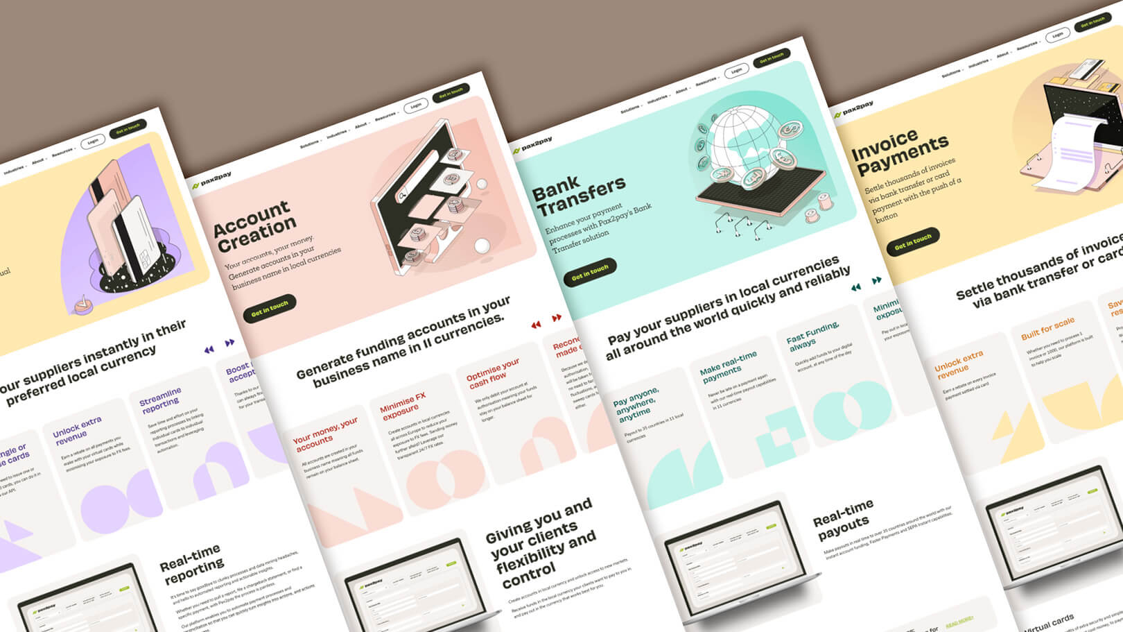
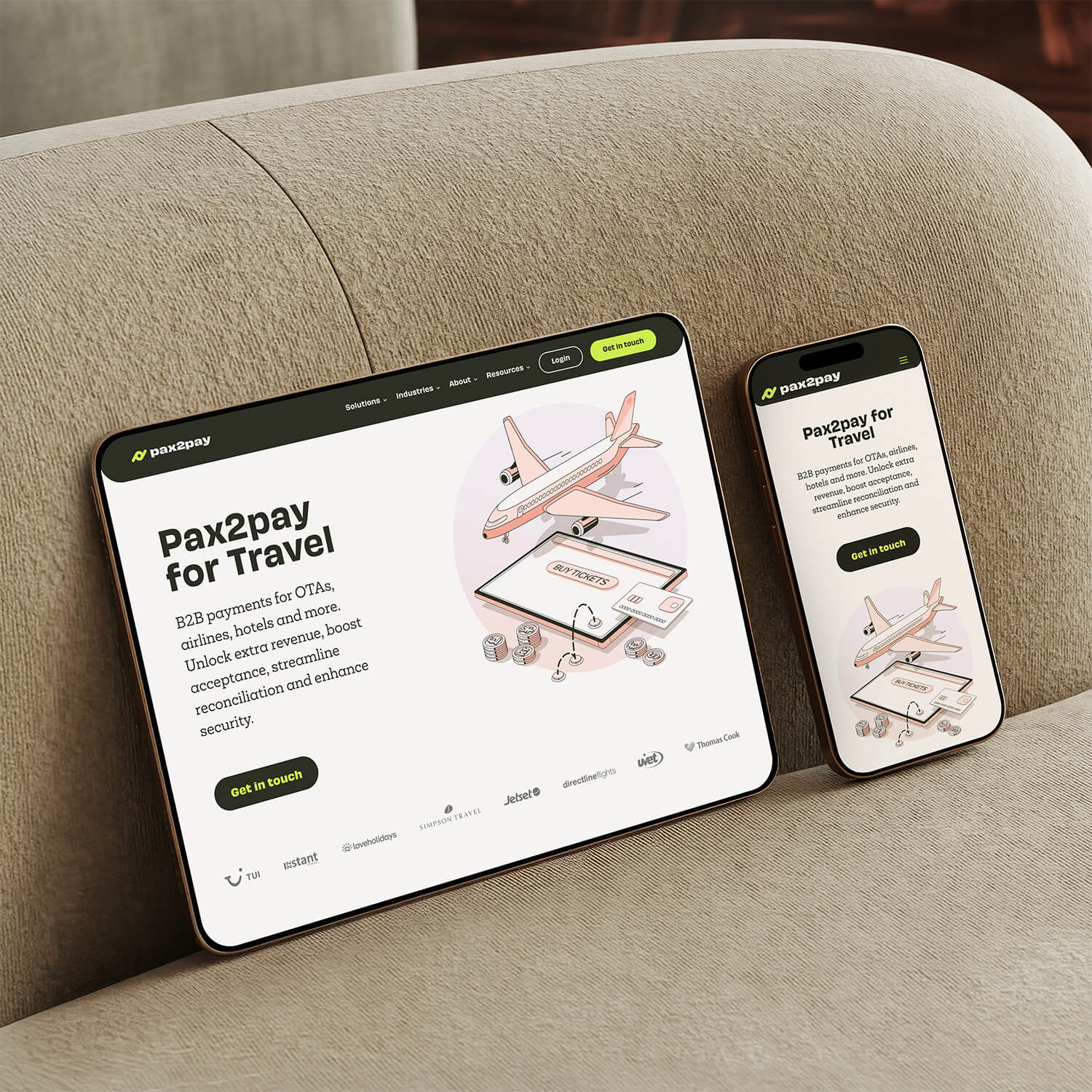
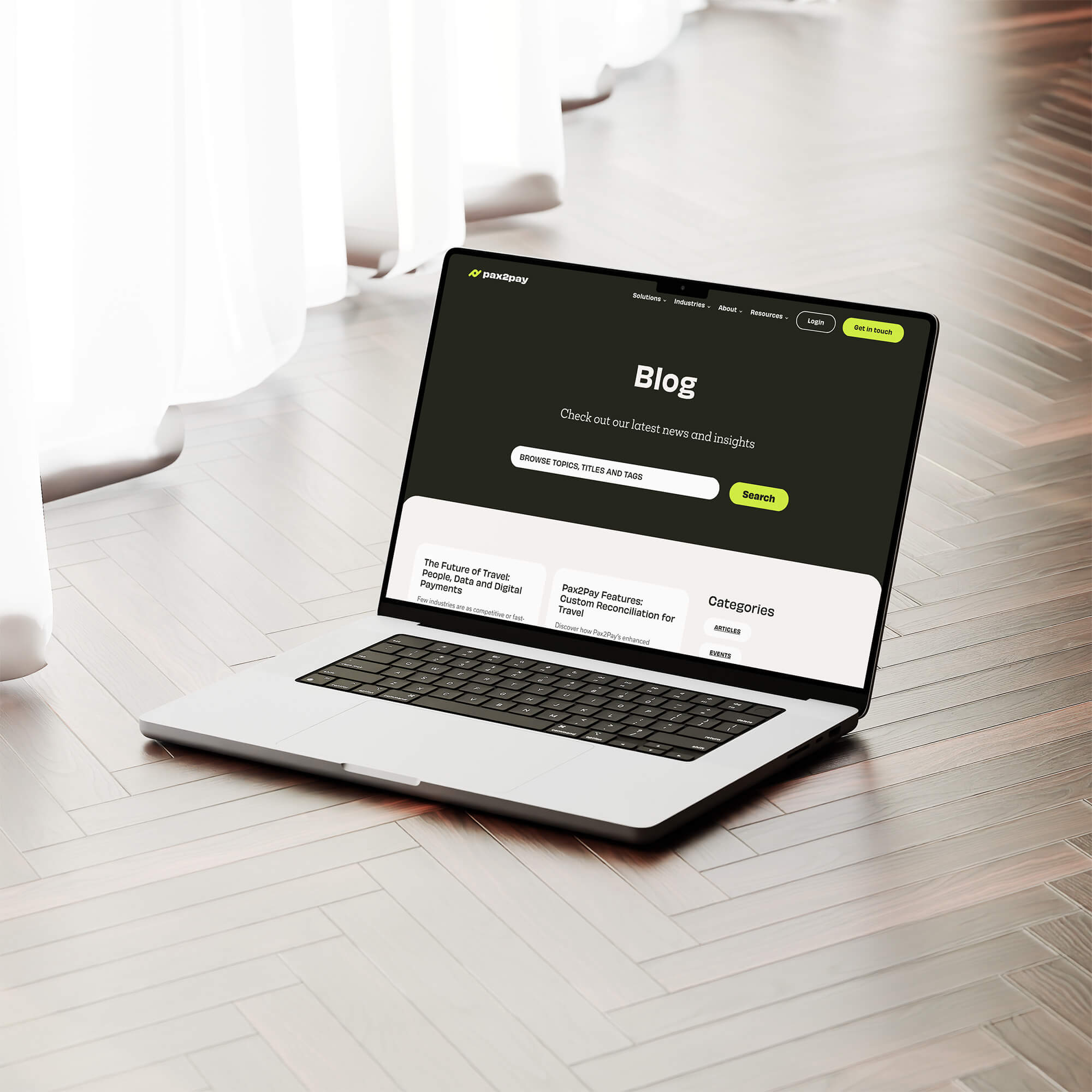


Each solution page needed its own visual moment without breaking from the broader brand system. Assigning a distinct color per product, giving the layout a natural structure that made a complex platform feel navigable without requiring a visitor to read through everything to understand what was on offer.